Introducing Mallory: First typeface from Frere-Jones Type, available to host on Typekit
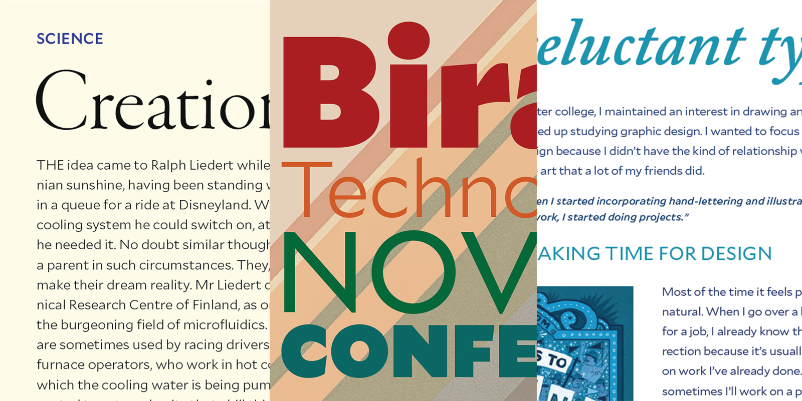
Mallory, the first typeface from Frere-Jones Type, is a British-American, geometric-humanist hybrid typeface designed to work well alongside many other popular typefaces. Purpose-built for use both in print and on screen with minimal fuss, all of Mallory’s weights and styles are available to license directly from Frere-Jones Type and host on Typekit at no additional cost.
Tobias Frere-Jones decided that his foundry’s inaugural typeface should be an experiment in mapping family history onto type history, so like himself (Mallory is one of his middle names) it has a mix of British and American influences. Tobias describes Gill Sans and Metro – an American response to Futura – as Mallory’s “parents.” The result is a crisp, cosmopolitan typeface that feels timelessly stylish — but also comfortable. And like a good pair of blue jeans, it looks great with anything.
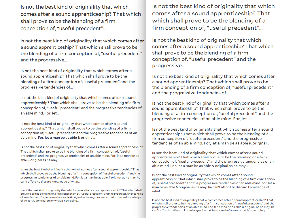
The core five of Mallory’s eight weights come in MicroPlus styles, made for use at small sizes both on screen and in print. On screen, they’re best used at sizes below 1em (16px). In print, they shine from 7pt all the way down to an incredible 4pt!

Mallory, Book (left) and MicroPlus Book (right).
The same qualities that help a typeface succeed at text sizes on screen also help in print, at very small sizes and in coarse conditions, Tobias says. He should know: he designed a custom typeface, Retina, for stock listings in the Wall Street Journal, and worked on the design of Verdana alongside Matthew Carter prior to that — not to mention the dozens of web fonts for which he’s done the hinting.
“Making type work well at small sizes in coarse contexts — I don’t know what parts of the web you could say have 500 years of beta testing behind them, but this does,” says Tobias.
By drawing from our past, we can better face today’s design challenges — challenges like making sure that small text is readable in any context, and that fonts for small text feel like a proper part of a larger type family. We’re really excited to see Mallory and its MicroPlus variations put to good use, and we can’t wait to see what Frere-Jones Type comes up with next. Cheers, Tobias!
To use Mallory in your kits, select the web license from Frere-Jones Type (scroll down for the license options), and transfer it to your Purchased Fonts library. While it isn’t available for syncing through the Creative Cloud app, the perpetual desktop license from Frere-Jones Type will enable you to use Mallory in any of your desktop programs.
2 Responses
Comments are closed.

Hi Tim. thanks. just a note, the sample image looks blurred, it must be calling the wrong size? when downloaded and viewed at full size, the image is correct and the type looks good.
Are you on Chrome by any chance? I’ve noticed its image scaling has taken a hit recently, images end up looking a bit blurred if they have to be resized.