Sites We Like: The Palm Springs Project & Philadelphia Center for Architecture
Architecture and typography have a lot in common, when it comes to applying design sensibility to something that needs to function in a very real way — be it the words we read or the buildings we inhabit. This week’s roundup highlights a little of both.
The Palm Springs Project
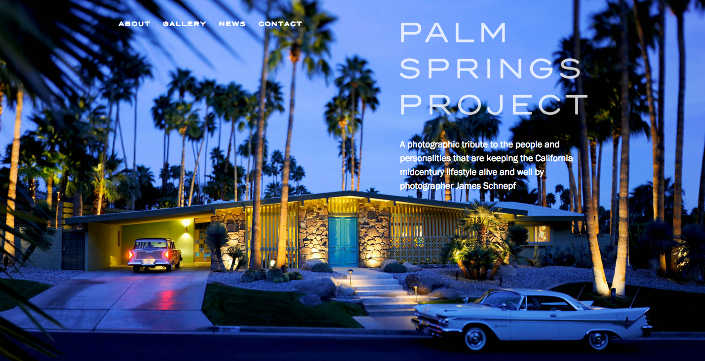
The Palm Springs Project is a photographic tribute to midcentury architecture and style sighted in this corner of southern California. Body text is in Franklin Gothic URW, which is more commonly sighted in headings but looks pretty smart in this image-heavy context. Headings are in Trio Grotesk from Schick Toikka.
Philadelphia Center for Architecture
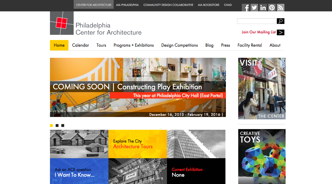
The Philadelphia Center for Architecture offers tours, exhibitions, and programming to explore the rich history of building design and planning in the area. The website uses Futura PT for all the text — appropriate for an organization dedicated to design history, and sets a friendly, open tone in addition.
That’s it for this week; share sites you like in the comments!