Sites We Like: Frequency & Foreword
Simplicity in web design can be a tricky balance between visual interest and usability. This week we’re highlighting a couple of agency websites who hit just the right note with their style — and also showcase a few workhorse type families at their best.
Frequency
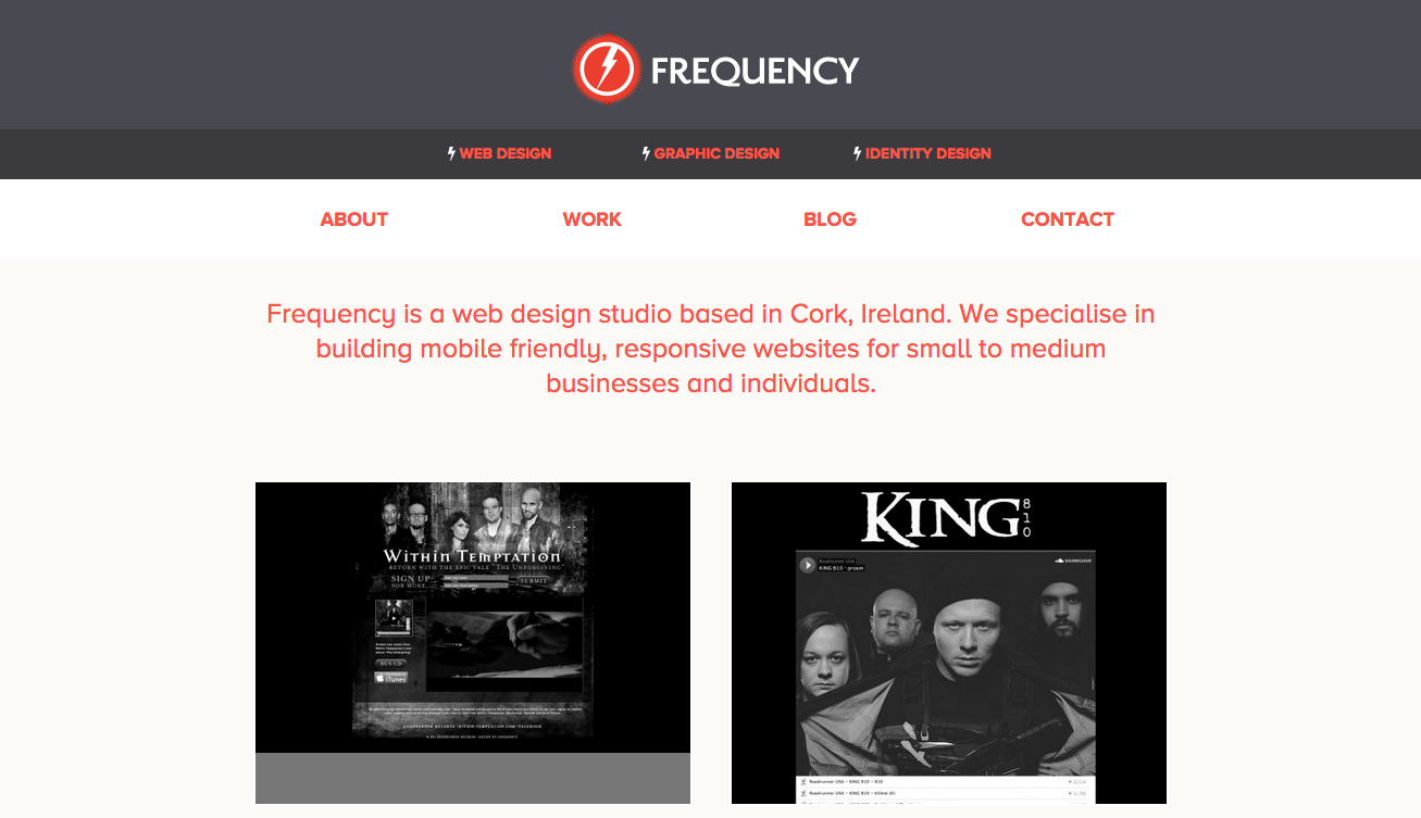
Proxima Nova Alt demonstrates a slightly different side of the workhorse Proxima Nova family on the website for Irish web design firm Frequency. The typeface lends an easy, fluid feel for most of the text on the site, and Metronic Slab makes for a nice blocky contrast in some of the subheads throughout the site.
Foreword
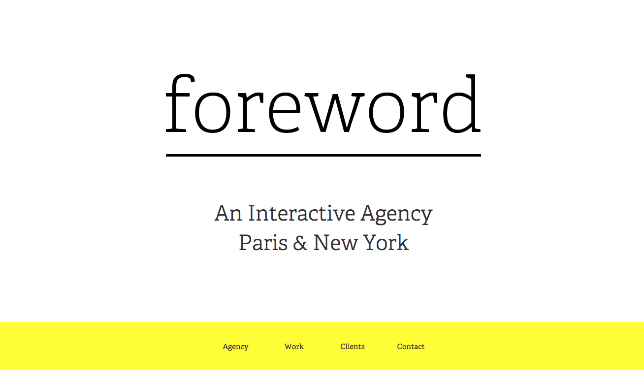
Digital agency Foreword puts together a lovely website with popular slab serif Adelle front and center. Sizing this typeface up really shows off its character, and the minimal page background emphasizes this even more.
That’s it for this week; share sites you like in the comments!