Backslanted ligatures & beyond: Paul Hunt on digitizing Bulletin Script No. 2
We’ve been having a lot of fun with fonts from Hamilton Wood Type Foundry lately, especially since we added so many new ones to our library last month. Some of Adobe Type’s own designers even got involved with the digitization work for these historic fonts — most recently Paul Hunt, who worked on Bulletin Script, № 2.
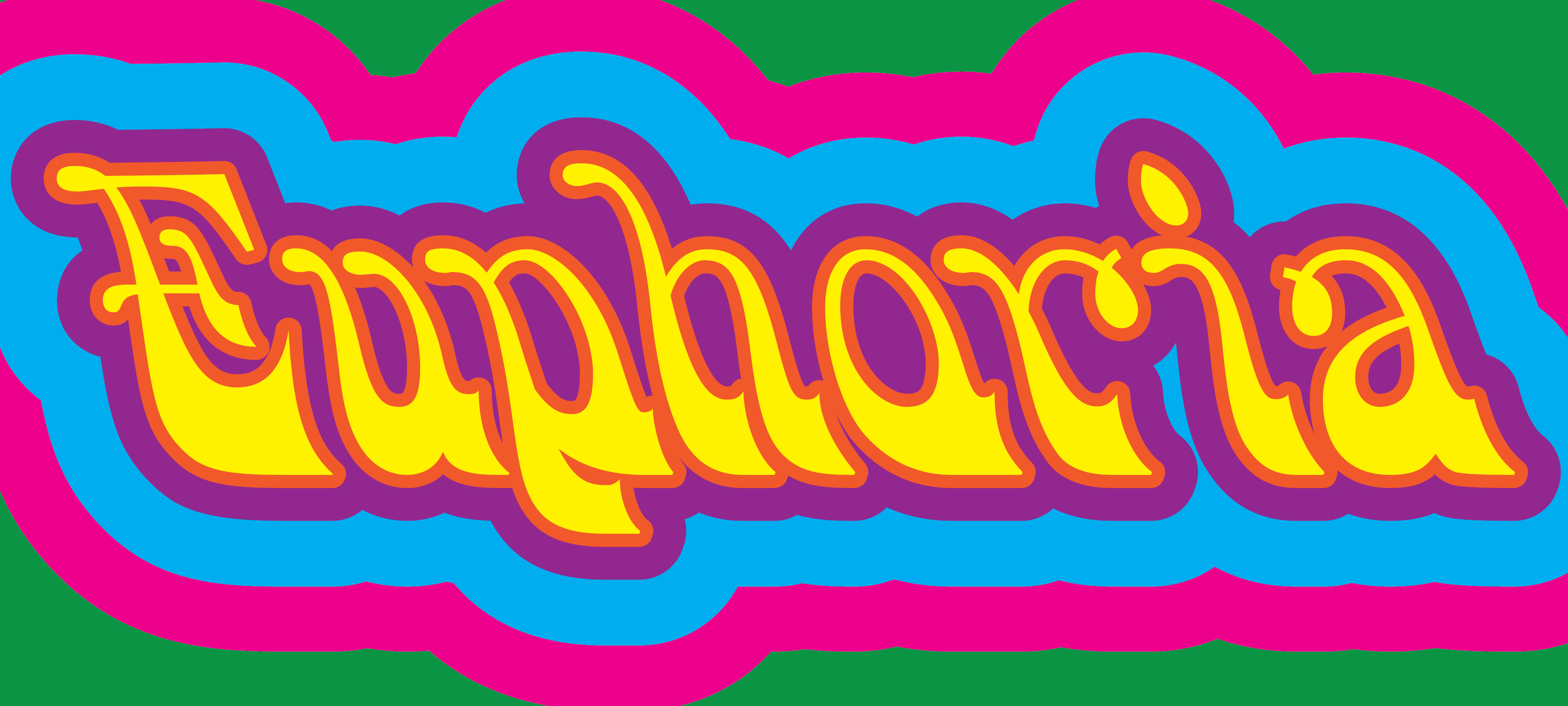
Bulletin Script, № 2 is a pretty psychedelic-looking font. It was just one of several digitization candidates selected by Rich Kegler of P22 Type Foundry (who is heading up the effort), but it stood out to Paul. “It was the weirdest design in the set of candidates,” he explained. “I’ve always had a soft spot for over-the-top ornate Victorian types, and this one definitely qualifies.”
Bulletin Script is one member of a larger typeface family, which was called “Bulletin” by some foundries, but not consistently. Paul explained, “This is actually a bit of a tangled ball of yarn, with different foundries calling this design many different things and the ‘Bulletin’ name being applied to a whole host of related designs. But usually the styles labeled ‘Bulletin’ feature the distinctive backslant.” On the Behance page for the digitization project, Paul noted the variously-named specimens he pulled from when piecing together sources for the design, including “Hamilton 117” (“Not very catchy,” he commented) and “Heber-Wells Bulletin Condensed.”
So, how do you make a digital typeface, when you’ve got just physical artifacts to work with? It’s a long process, but Paul was happy to walk through it a bit.
Have you done a digitization project like this before?
Much of the work that I did at P22 Type Foundry, where I broke in my type chops, was digitization of various designs. Some personal favorites that I have among these projects are P22 Underground Pro — it’s on Typekit! — Pabst Swash, Fournier Le Jeune, and Goudy Heavyface. You can see the full list of things that I digitized for P22 on their website.
What kind of shape was the original specimen in?
Getting good reference material for digitization was actually the hardest part of this process. There are multiple similar versions of this design from different foundries of the era. Not all of these were very nice. However, Rich provided me with quite a lot of photographs of the actual wood type and much of my digitization work involved referencing these photographs directly.
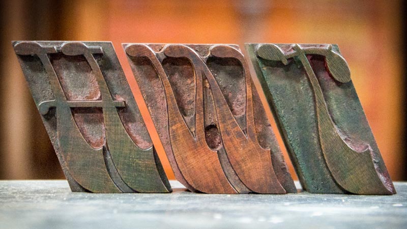
HWT in Bulletin, № 2 wood type — photo by Hamilton Wood Type and Printing Museum
What did you find to be most challenging about the digitization process?
The hardest part in digitizing this particular design was trying to harmonize the features of the typeface, since different parts came from different sources. Also, because the design is so irregular it was difficult to try to coordinate things like stem weights, character heights, line quality, &c.
Did you have to make any accommodations or improvisations to the shape of the letters?
In creating a digital version of this typeface, I tried to be faithful to the best existing versions of the type forms that I could find. But harmonizing the design elements of shapes taken from disparate sources was a challenge. Some of the improvised glyphs I’m proud of, like the “@” sign, which is always fun to adapt. The diacritics are also my design, and hopefully they are in line with the rest of the design. At this point I should also try to excuse myself for the ugly design of the ligatures: they are in the digital font as they were in the original type.
What makes the ligatures “ugly”?
I say “ugly” because of the obvious collisions of the hook of the “f” with the “i” in the “fi” ligature. Actually, the collision between “f” and “l” is nicely resolved with a little loop. I don’t see this as limiting the usage of this typeface; it’s just one more quirk in this already-eclectic design.
Do you think the end result shares any characteristics with other typefaces you’ve worked on?
I guess you could say that this face is what would happen if Killkenny — my digitization of Hermann Ihlenburg’s Nymphic — and Zaner — my adaptation of C.P. Zaner’s ornamental handwriting — had an eccentric child.
That’s an awesome, hilarious description. How would you describe the personality of Bulletin Script?
If I had to imagine the personality of this particular member of the Bulletin family, I would describe it as being fun and funky with a little bit of self-deprecating humor. This design doesn’t take itself too seriously, and neither should the designer who chooses to invoke it.
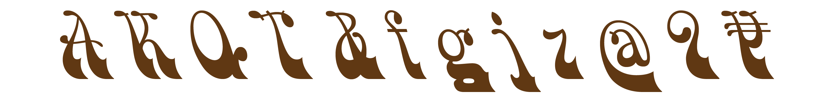
Paul’s favorite glyphs in HWT Bulletin, № 2: A K Q T & f g j z @ 9 ¥
What do you think would be some good applications for Bulletin?
Concert posters. Psychedelic website lettering. Tattoos. Logos. Quirky wedding invitations. Packaging for vegan, organic, artisinal moustache wax. Paired with woodcut illustrations. Anywhere a whiff of Victorian design sensibility is desired.

HWT Bulletin, № 2, HWT Tuscan Extended & HWT Gothic Rounded in use.
Do you hope to work on digitizing another from the Bulletin family at some point?
I would very much like to digitize ‘Bulletin Script, № 1,’ which would be Hamilton’s № 310 and popularly known as ‘Smoke.’ However, I would like to be able to find some more comprehensive samples of the design to reference before committing to doing more work on the Bulletin family.
Thanks to Paul for taking some time to talk about his work here. Ready to try this one out in your own projects? Bulletin Script, № 2, is available for desktop sync as well as web use. Let us know how you like it!