Sites We Like: Nice Letterform & Tim Gasperak
In this week’s Sites We Like, we’ve been inspired by these two reflections on beauty: one in the shape of letters, and the other in the natural world around us.
Nice Letterform
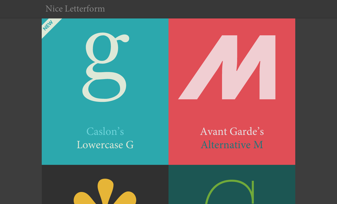
We were pretty impressed by Nice Letterform, a project of Matt Mitchell’s from last year. We hope to see more updates on it, but for now it’s still a lovely testament to letterform and typography. Body text is set in Minion, with headers in Proxima Nova — both classic choices for giving the content weight as well as beauty.
Tim Gasperak
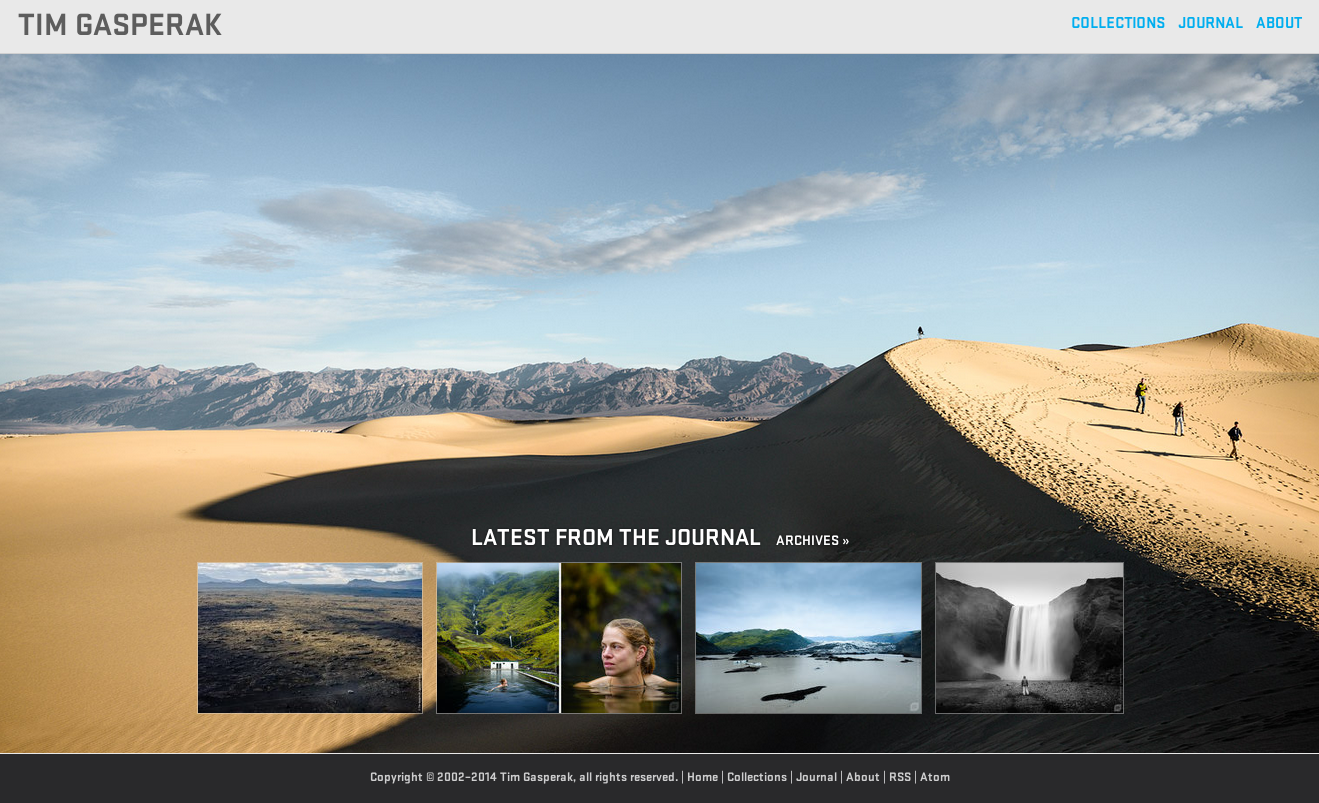
Tim Gasperak showcases a sampling of his impressive photography on his website with an uncomplicated design that really lets the photos shine. Both of the typefaces he uses are from Process Type Foundry and hosted by Typekit. Stratum gives the headers and titles an edgy character with its decisive angles and slab-like letterforms, while charming Elena makes for comfortable, inviting body text.
That’s it for this week; share sites you like in the comments!