Sites We Like: Kevin Clark, Evan Kerrigan, & Isaac Paavola
We notice a lot of people using Typekit for their personal portfolio sites, and we never get tired of seeing all the different approaches people take here. This week, we’ll highlight a few that caught our attention.
Kevin Clark
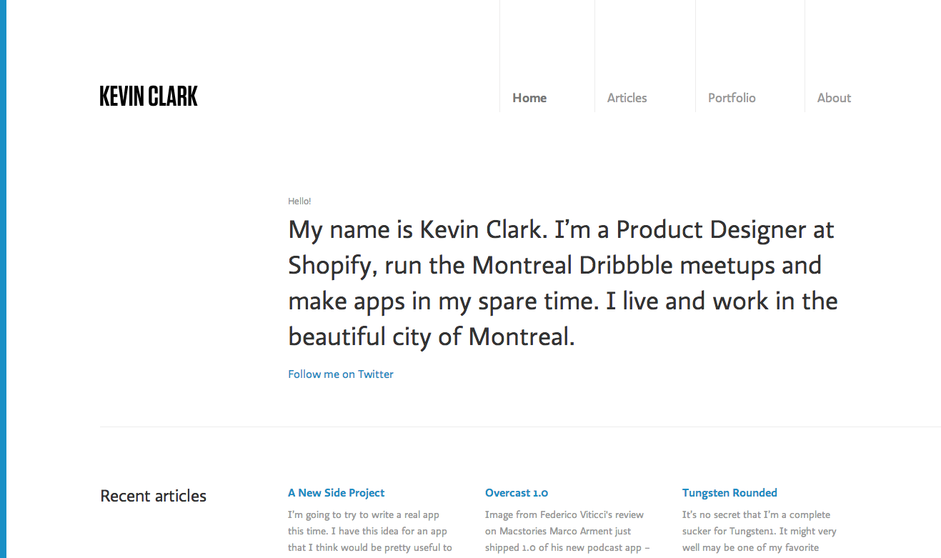
Simplicity is the word here on Kevin Clark’s website, with Ratio used for nearly all the type on the page. This is a great selection, and we love how this acts as a demonstration of Ratio’s flexibility: the headlines really show off the unique features of the typeface, but this is muted somewhat in the body text so that the language can take the lead. Great balance.
Evan Kerrigan
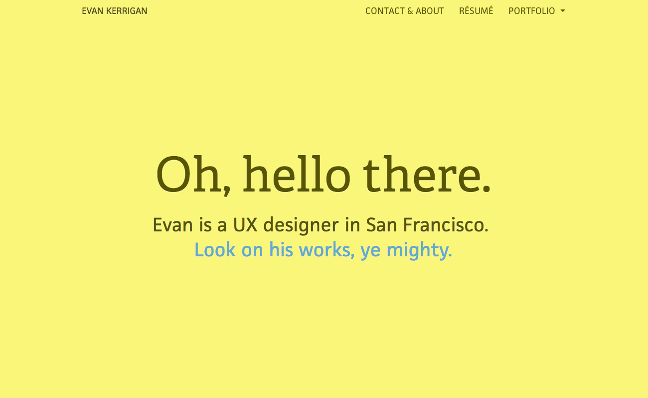
When in doubt about type pairings, go with a serif and a sans; Evan Kerrigan‘s bright portfolio site does a lovely job illustrating this reliable approach. Adelle‘s slab character brings great energy into the headings, while JAF Facit makes for friendly and unfussy body text: a solid pairing across the whole color spectrum.
Isaac Paavola
Isaac Paavola uses just a touch of animation to really bring his brightly-hued website to life. JAF Facit plays a steady role in the headers and navigation here, while Gesta is used for all body text and subheads throughout. As a bonus, there’s just a touch of Bistro Script hidden in one of the animations; see if you can find it!
That’s it for this week; share sites you like in the comments!