New fonts from TypeTogether and Rui Abreu
We are thrilled to announce a full shelf of new releases at Typekit today. You can now get your hands on new fonts, extended families, and added desktop availability from two longtime Typekit foundry partners: TypeTogether and Rui Abreu. Let’s get to it.
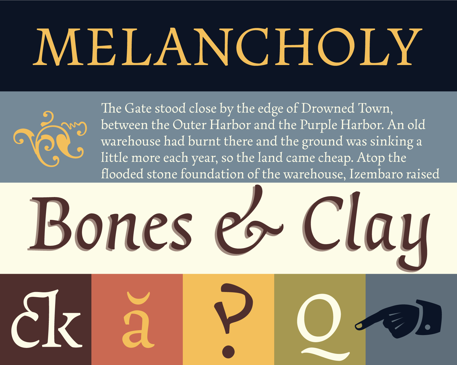
Essay Text from TypeTogether
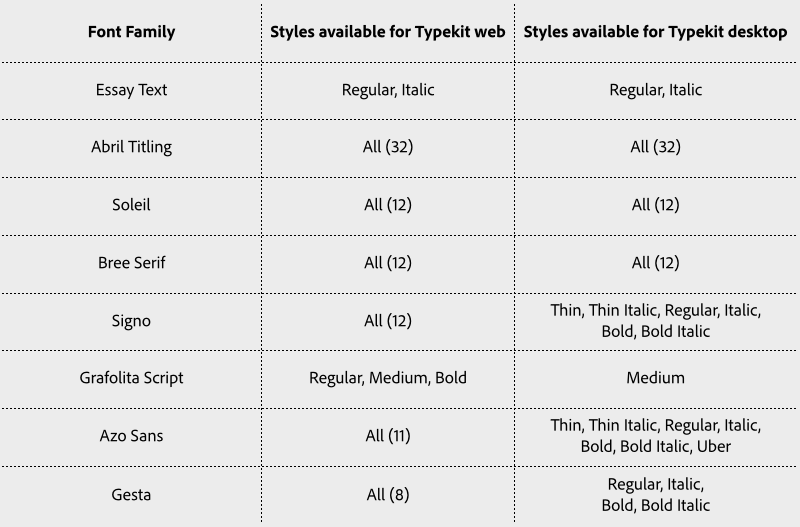
The lovely Essay Text by Stefan Ellmer is a serif text face comprised of an upright and an italic. Drawing from the historical context of the Renaissance, the italic can act as a complement to the upright, or stand on its own as a text face. Both carry a calligraphic slant, more comparable to each other than is typical of this pairing. Don’t miss the stylistic alternates and other typographic and ornamental goodies hidden within. Both styles are available for desktop sync for Creative Cloud subscribers.
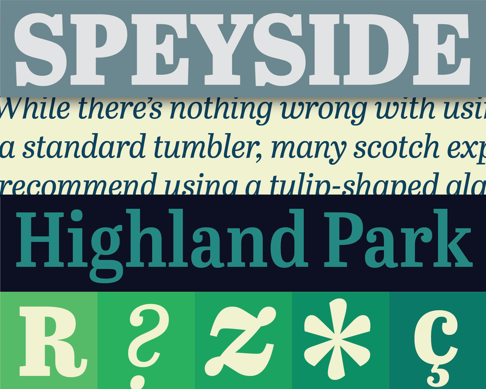
Abril Titling from TypeTogether
Welcome the newest addition to the Abril family: Abril Titling. A well-stocked font family in its own right (eight styles in four different widths), the letterforms, contrast, and spacing are revisions of Abril Text — sturdier than Abril Display, while more suitable than Abril Text for larger sizes, and more varied in available widths. All 32 styles are available for desktop sync!
We’ve also updated two other TypeTogether families, with italic versions of the geometric sans serif Soleil, and the casual slab serif Bree Serif. Both families are available for desktop sync.
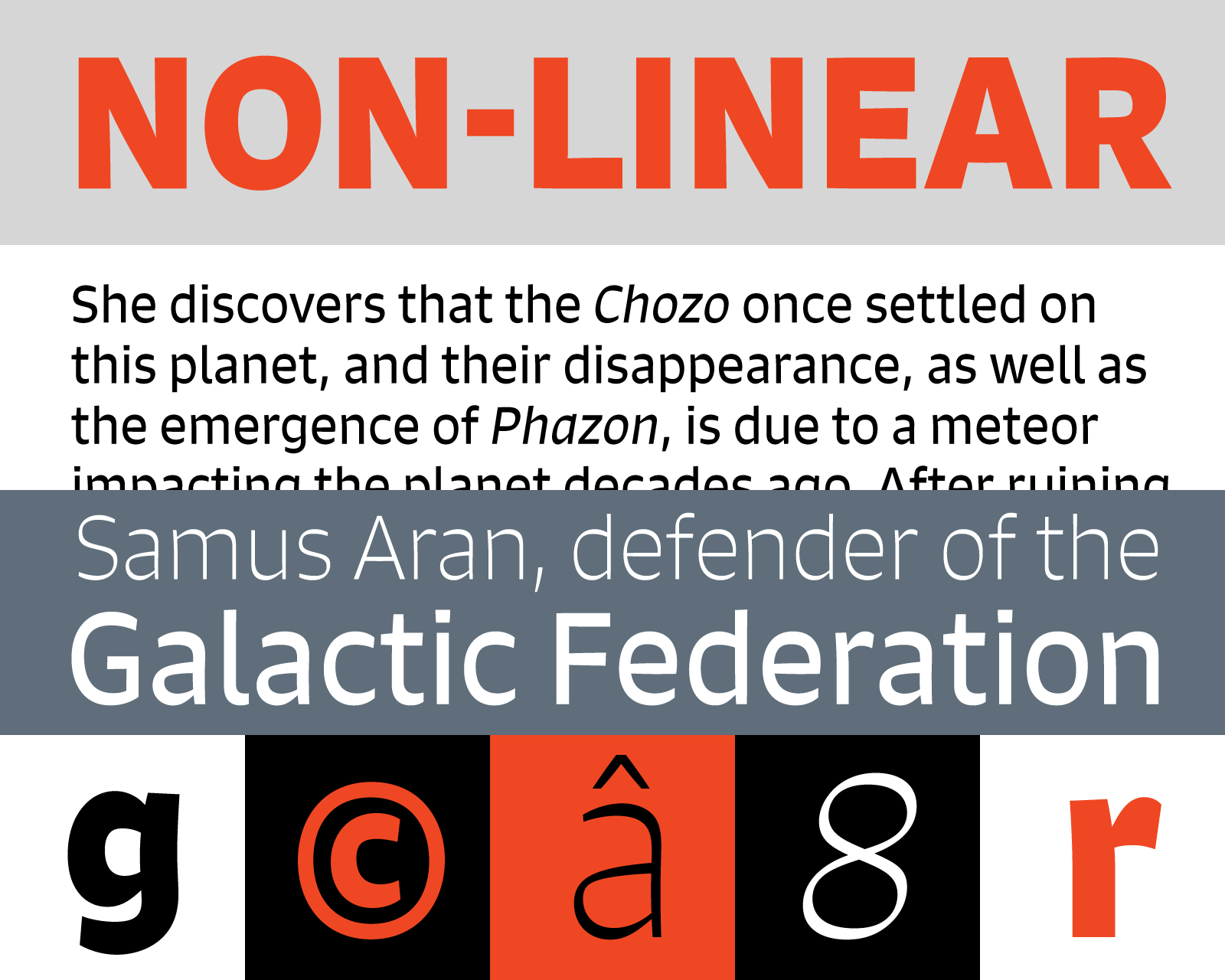
Signo from Rui Abreu
Also new to Typekit is Signo from Rui Abreu. Signo’s reverse contrast letterforms (the horizontal strokes are heavier than the vertical strokes, contrary to most type designs) stand out when set in headlines and in editorial environments. The heavier horizontals also help the visual continuity of characters in lines of text. Aided by a high x-height, open counters, and TrueType hinting for some older Windows browsers, Signo also performs well in body copy. Select styles available for desktop sync.
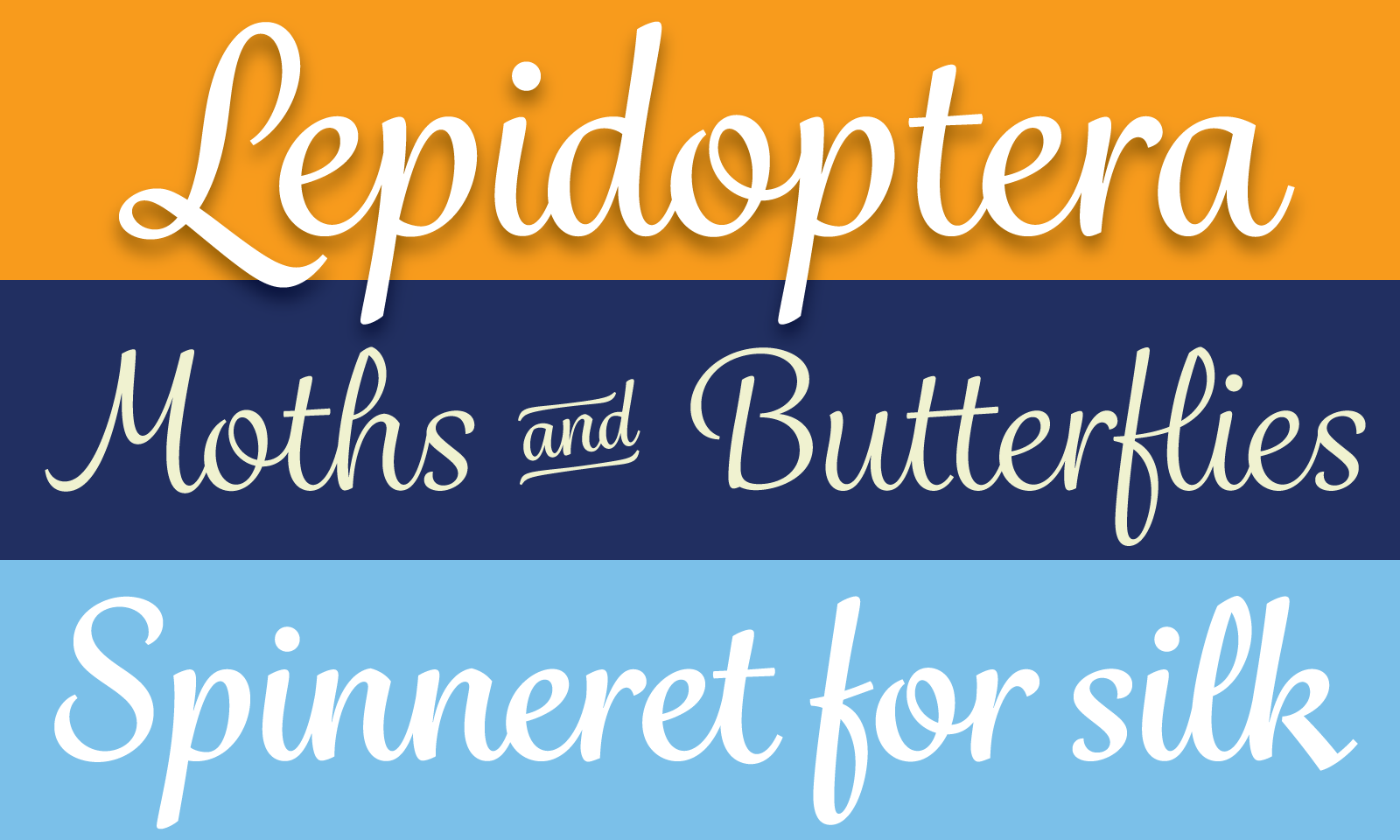
Grafolita Script from Rui Abreu
Rui’s warm, inviting Grafolita Script has an easy fluidity achieved by careful design of glyph-connecting finials and contextual alternates where connections make less sense. Grafolita Script comes in three weights, with alternate superscript underlines and special ligatures for “and” and “or” to lend it a touch of sign-painted whimsy. Grafolita Script Medium is available for desktop sync.
Azo Sans Uber and Azo Sans Bold from Rui Abreu
Azo Sans Uber is the ultra heavy display weight of Rui’s Azo Sans (shown in the last line of the sample above). It’s packed with personality, with contextual alternates like the R and Ys above that give the chunky sans serif an air of playfulness. Some styles of Azo Sans are also now available for desktop sync.
Rui’s popular typeface Gesta has now also been extended for use in Creative Cloud desktop sync. Check out Nick Cox’s excellent About Face article on Gesta.
Font families mentioned in this post, and their availability for web and desktop at Typekit, can be seen in the table below.
Have at ’em! If you’ve never tried Typekit, sign up (it’s free!) and upgrade to a paid plan when you’re ready.
One Response
Comments are closed.
This is great stuff! In particular, it’s good to see the full set of fonts in these typefaces being made available for desktop (print) use. The mystery is, why aren’t Adobe Originals like Brioso, Kepler and Cronos also fully available? Certainly it’s not a licensing issue. It’s bizarre to see Display, Subhead and Caption opticals listed as “web use only.”