The mysteries of Type Quality Engineering explained (or how a font gets out the door)

This article was written by my co-worker, Ernie March. Ernie has been our font QE guy for almost 20 years. After some subtle hints (no pun intended), I was finally able to talk him into writing something about all the work that goes into making sure we deliver high-quality fonts to our customers. This is Ernie’s first post on our blog, and I certainly hope it won’t be his last.
No, we don’t just throw it over the fence!
When it comes to font development, our design and production team spends a good deal of time making choices: deciding what the font should look like, what sort of language coverage it should have, what OpenType features it will contain, etc. Then they get down to the serious business of actually creating the font.
The team does a lot of testing during this process, and asks for input from experts in languages/scripts where we don’t already have expertise in-house. Rather than just throw them over the fence once they think they’re done, my co-workers send the fonts over to Quality Engineering (also known as my desk). I test the look, accuracy, and functionality of everything imaginable. This testing involves checking the validity of all the tables in the font file using Adobe Font Development Kit for OpenType tools, including a separate check of the outlines, plus the language coverage and Unicode values. Once the files pass these critical tests, a set of visual proofs are created and carefully examined. Among other things, this proofing includes creating waterfalls in order to check stem hints and alignment zones at a variety of sizes—both onscreen and in print—and glyph dumps to check shapes and accent/mark placement.
To view the full PDFs click on any of the images below.
The next step involves more testing (and more testing). I install the fonts on both Mac and Windows test systems and run through a number of commonly used applications. At this point, I’m confident that the fonts are valid, but this is where I get to see if they really work the way they’re expected to—some of these feature files can get pretty complicated. The typeface designers do feature testing during development stages using AFDKO tools, but there is nothing like a little real-world testing as a crosscheck.
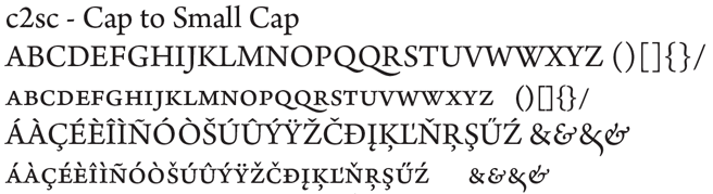
Test OpenType features in InDesign. This is the most extensive test, because InDesign has the most extensive OpenType feature support of all Adobe applications. Using the source feature file created by our production team, a custom document is built to test each OpenType feature in the font. Since feature sets vary from family to family, each of these tests is somewhat unique. For most text designs, InDesign OT testing is not terribly difficult and only consists of a few pages. But for fonts like Bickham Script Pro and Caflisch Script Pro, which have extremely large sets of contextual substitutions, testing can be a bit daunting, with test docs running to dozens of pages.
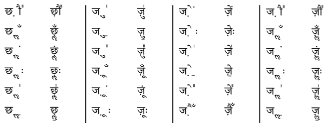
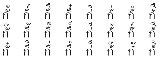
Subset—Test mark placement/OpenType features in complex scripts like Indic fonts, Hebrew, Arabic, and Thai. These scripts require extra testing docs in order to validate all the various mark positioning possibilities.
Test OpenType features in Illustrator. Since Illustrator has support for fewer OpenType features than InDesign, a briefer feature test is made in addition to testing basic functionality.
Test basic functionality in Photoshop, MS Word, QuarkXPress, CorelDRAW, Pages, TextEdit, and FontBook. When apps have any OpenType feature support, a lighter test than the one used for InDesign is made to test those supported features in addition to testing basic functionality.
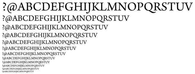
Dump all the glyphs in InDesign and Word. This test checks to see that all the glyphs are accessible, either through a glyph palette, a character map/palette, or a feature.
Print to PostScript and non-PostScript printers.
Export to PDF from InDesign, check in Acrobat, print.
Amusing side note: My main QE machine is a PC; everyone else in the group uses a Mac. Yet another check.
Once we’re happy with all these checks, the fonts are moved into our source code depot and marked GM. But the fun doesn’t end there.
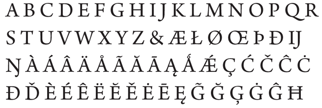
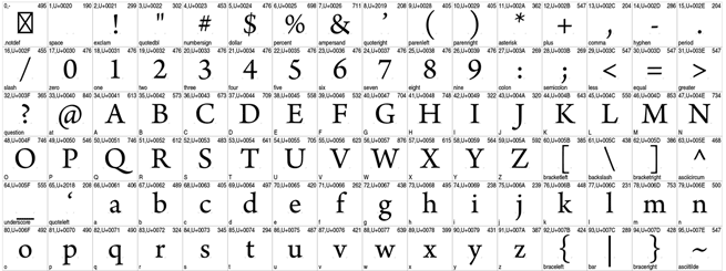
We create the download package consisting of the font file(s), End User License Agreement, and Readme.html. A font-specific Readme is also generated, which includes a brief history of the design and how the style links work, along with any pertinent release notes. We also put together Glyph Complement(s) showing all the glyphs in the font(s) so they can be posted with the font(s). Since almost every font we design ourselves has a unique character set, the glyph complements (shown above) are unique to each family.
Now it’s ready for primetime.
8 Responses
Comments are closed.
It might be worth adding HTML+CSS testing to your matrix. Even though few web fonts and sites make use of OpenType features, current browsers have far better OpenType feature support than InDesign and Word.
Si – indeed, I had some HTML which I neglected to mention, but now I have much more. Thanks for the suggestion. I have fun putting it together.
+1 to comment by Si.
I’d be curious to see the results of such testing, too.
Have they got Photoshop to work with Indic fonts yet? Look at the Sihari in ‘Programs that work . . .’ on http://www.billie.grosse.is-a-geek.com/resources-03f.html
It would be nice for Adobe to get the basics of spelling correct for millions of potential users who have to resort to using fonts with ASCII mappings of characters because expensive image processors can’t spell yet.
Perhaps that is one to include in the post production testing. I do when I design a font.
Yes. Since CS6. But you’ll need to turn on the World-Ready Composer, by going to the Type pane in the Preferences, and switching the Text Engine option to “Middle Eastern”. See this video to learn how https://www.youtube.com/watch?v=gfuw7m5mVTk
You will also need to use fonts with OpenType tables. I’ve just tested some Hindi words using Adobe Devanagari fonts and they all rendered as expected.
Many of the combinations in the Thai pdf are not real possibilities so I’m wondering why they need to be tested. Do you need to make sure that nonsense input strings are displayed as typed? I’m guessing something needs to happen when tone marks are typed onto tone marks.
Bendy – yes, part of the point was to test all the mark-to-mark stuff, even if it was junk.
Hi Ben. What you’re seeing is the result of a “brute-force” test. The source files of our Adobe Thai were switched from VOLT to FDK (FEA syntax) so we wanted to make sure that nothing broke in the process. The easiest way to do it was to write a handful lines of code to generate all the combinations, with disregard to if they were real-world cases or not. And we actually found some real issues in the source files which only manifested under some circumstances. Finding those doing ad-hoc testing would have been a lot more tedious and less reliable.
But this is not the approach we usually take. When testing the mark positioning or the consonant-vowel sequences of a new release, we normally stick to real-world text.