How we go about adding new fonts to Typekit
Every day, our customers write us asking if we can add specific new fonts to the Typekit library; it might be a font that they’ve chosen for a project, that is part of their corporate identity, or that they’ve custom-designed for a client. We love hearing these requests from you, since they help us understand which foundries, designs, and designers are most popular with our customers, so please keep them coming!
We’re continually working with new fonts and foundries, and in this post we wanted to share some of the details with you about what’s involved when we add a new font to the Typekit library.
Licensing
The most important obstacle between you and your new font is licensing. Before we can offer a font via the Typekit library, it must first be licensed to us by the issuing type designer or foundry. The foundry must first agree that they want their fonts to be available this way, and then work with us to create a license agreement that works for both sides.
Today, more than 60 major commercial and independent foundries have license agreements with Typekit. These relationships make it possible for us to offer one of the broadest and most diverse libraries in the industry. However, the individual attention that must be paid to each of these agreements can make them time-consuming to complete.
Many people assume that if their company has already licensed a font for use in their branding, they already have the license they need to use the font on the web. This usually is not the case: most commercial desktop font licenses do not permit the licensee to use the font on the web.
Specifically, many licenses prohibit the licensee from redistributing any version of the font file to a third party, or from putting the font files on servers accessible to the general public. Any commercial web font service must be certain not to run afoul of those requirements when preparing fonts for use on the web.
Font processing
Many of you are familiar with free or open source tools that convert standard desktop files into the formats used on the web, or with web fonts services that allow you to upload your own fonts directly. While we do use some of these same open-source tools for font processing, the results they produce on their own are very different from what you’ll find in the web fonts we select for inclusion in the Typekit library. In addition to licensing issues, the reason Typekit doesn’t offer any facility for end users to upload their own fonts is simply because we haven’t found an automated process to dependably produce results that measure up to our own standards.
Our font processing pipeline also depends heavily on the careful evaluation of each font variation by our Type Team throughout the conversion process. Here are some of the main issues that we deal with when processing fonts:
- For file size efficiency, we rebuild fonts so that reusable parts (like accents that appear above many letters) are only present once. This is called componentization, and it involves editing glyphs’ bezier outlines. Outline editing is also occasionally required after format conversion from PostScript to TrueType (or vice-versa), to ensure design fidelity.
- We sometimes contribute PostScript hints and, if a typeface was made for use at text sizes, TrueType instructions. These adjustments dictate the rasterization of font outlines on screen.
- To be sure that fonts have proper semantic value, we remove or reassign glyphs that have incorrect Unicode code points. We also add common missing glyphs like nonbreaking space and soft hyphen, and work with our foundry partners in cases where essential characters are absent.
Browser testing
We understand how important it is for visitors to your sites to have a consistent experience across different browsers and devices, but even with the very best processing and the closest attention to detail, font rendering will always vary from one platform to the next. This is why we’ve made such an enormous investment in our Browser Samples system, which we recently updated and described.
In addition to demonstrating how a given variation will look across a variety of devices, this engine also gives us an incredibly powerful means for revealing rendering issues that might only show themselves in the context of a specific combination of font variation, browser, and operating system.
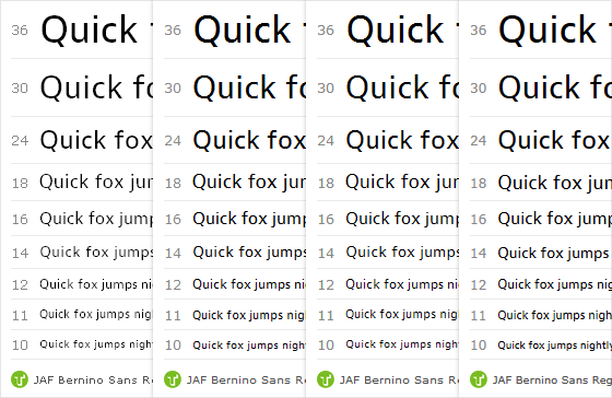
From left to right, JAF Bernino Sans Regular in IE6 on Windows XP, IE8 on Windows XP, Chrome on Windows 7, and IE9 on Windows 7.
On Windows, type rendering quality often depends on the success of TrueType hinting, which we measure by the legibility of rasterized letters and by their faithfulness to the typeface outlines. But Windows rendering also depends on the operating system’s active rendering engine, which can vary by OS version, browser, and browser preferences. So it’s critical that we study hinted TrueType fonts in a variety of Windows scenarios.

Freight Text Pro Book at 16px in Chrome on Windows XP: above, without smoothing; below, with smoothing enabled.
Font files contain a ‘gasp’ (Grid-fitting And Scan-conversion Procedure) table that controls the sizes at which smoothing is enabled in Windows GDI Standard rendering scenarios. Browser samples have shown us that disabled smoothing often results in poorly aliased text, so in general we apply smoothing at all sizes. This is especially important for the display fonts we serve with PostScript-based outlines, because they trigger GDI Standard rendering in many Windows browsers.
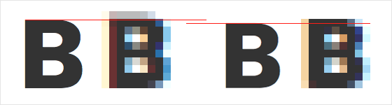
On the left, a blurry top edge; on the right, reducing the size of glyphs within their em box produces a more crisply rasterized shape.
Mac OS X ignores TrueType instructions, so the only way to control the way glyphs are rasterized is to change the shape of the outlines themselves. In a few cases, we have adjusted fonts’ outlines to avoid blurry edges at key font sizes in Mac OS X browsers.
Why we do all this
We put more time and effort into font processing than any other service we know of, and we do it so that we can be assured that we’re not compromising on quality. It’s important to us that we empower our customers to focus on designing with inspired type, without worrying that their end users might see something subpar as a result of poor quality control. We’re continually blown away by the amazing sites people build with Typekit fonts—in fact, we keep talking about them!
Our end of the deal is to make these fonts the absolute best they can be when we add them to our library. We can’t wait to see what you’ll do with them from there.