About Face: psType
Today’s About Face was written by Nick Cox, a front-end developer and designer from Seattle, Washington.

In this installment of About Face, we’re going to take a closer look not at a single font, but rather at the offerings of a foundry. Southern California’s psType Foundry contributes a number of solid and versatile fonts (two superfamilies and an additional face) to the Typekit library. We’ll get an overview of the work, and offer a few starting places to get the creative juices flowing using psType’s fonts.
Designer Mark Caneso began psType to supplement his graphic design work at Pprwrk Studio with a typographic lab. His oeuvre contains nearly a dozen typefaces in several genres, of which five are found on Typekit’s shelves: Runda, Ratio and Ratio Display, and Quatro and its slab.
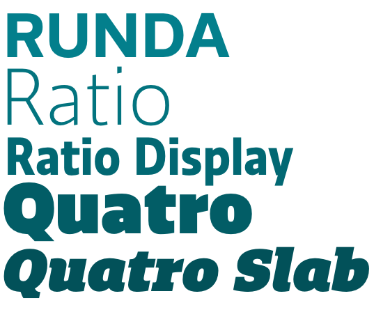
The psType fonts available on Typekit.
Runda
Runda exhibits an interesting mix of two diverse worlds: the geometric sans and the grotesk. In the light weight, Runda seems to draw a slight influence from the work of Adrian Frutiger; yet as the weights progress, Runda differentiates itself creatively. The result is a readable and flexible sans serif with a broad range of weights from light to black. One of the notable features of the face is its true italic, which offers a greater difference from the regular style than is typical.
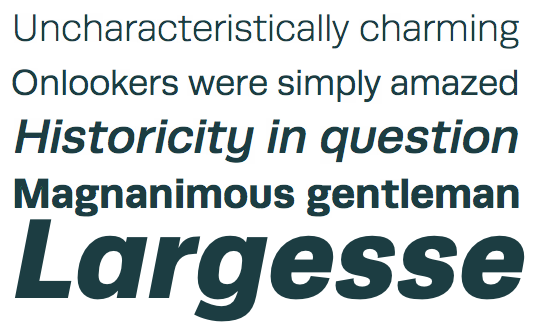
The Runda specimen shows a wide repertoire.
Paring Runda is an enjoyable task, given its generous number of weights and styles. As a titling face, Runda is loud and bold, especially when set in vivid colors. Yet it doesn’t steal the limelight: Runda is yielding enough to allow a pairing with a font with a strong personality (such as Bree Serif, below) to increase the emotional range.
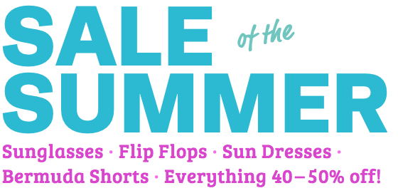
Neutrality is an asset: Runda makes room for a unique serif like Bree.
As a text face, Runda lends a subtle, Swiss-inspired sophistication to a paragraph. When set with a titling face with a strong stroke contrast like Abril Display, Runda’s light weight and uniform stroke widths add distinction to any text.
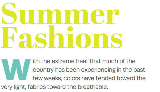
Runda calls Frutiger’s Univers to mind, but maintains its own personality as a text face.
Ratio and Ratio Display
Runda’s more humanist cousin, Ratio, has a subtle flair that is more felt than seen at text sizes. Close up, however, the top of the stems of many glyphs reveal an angle of about 12°, lending an angular, modern feel to the font.
A closer examination of Ratio’s angular stems. Hover to view without annotations.
Try Ratio with a solid slab serif like Adelle. The latter’s sharp terminals but overall round letterforms accentuate and play off of Ratio’s angularity, making it appear at once rational and refined.

Ratio’s open counters look elegant in the light weight.
Ratio’s companion display font is slightly condensed, giving it a greater spatial economy. This allows you to bump up its size without sacrificing horizontal rhythm. It looks particularly strong, yet neutral when set in all caps, accepting a broad range of pairings. It can easily set the stage for a slab like FF Tisa Web Pro to shine.

Condensed, but not overly so, Ratio Display sits well at large sizes.
Quatro and Quatro Slab
psType’s final family, Quatro and Quatro Slab, are a bouncy and jubilant pair. Quatro comes only in an ultra black weight. Use 50px as a minimum size when setting this headline-only font, and it provides a much more well-proportioned and cohesive alternative to Gill’s eponymous sans at the same weight.
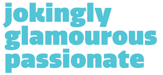
Move over Gill Sans Ultra Black; Quatro’s more coherent and more fun.
Large and in charge, Quatro adds fun and flair to headlines. Throw restraint to the wind and set it huge as can be alongside a rounded sans like Museo’s, and Quatro shows its boisterous and bouncy side with a great sense of humor.
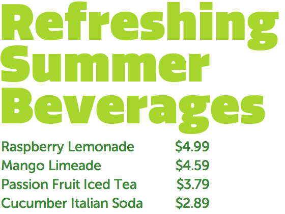
Quatro: you simply can’t get more fun than this without sacrificing readability.
Add slabs to Quatro, though, and the result is a surprisingly subtle font with many uses. Quatro Slab boasts a larger weight variety than its sister sans, and its uses are much more discursive.
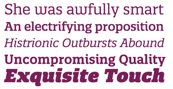
Angles, curves, and styles, oh my! Quatro Slab excels in a variety of situations.
Where Quatro is flamboyant, Quatro Slab is expressive, particularly in the italic. Set it with a geometric sans with uniform lettershapes like Faricy New Web, and savor the remarkable range of curves and angles on the terminals.
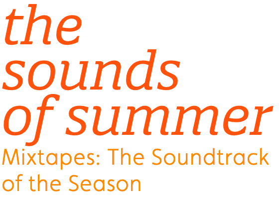
Quatro Slab sports its eye for detail.
If you’re looking for a fresh new foundry to enliven your designs, start a new kit and experiment with psType’s offerings. Their variety, details, and range of personalities are sure to make a creative splash in your next design.

Nick Cox is a front-end developer and designer from Seattle, WA. He writes about web fonts and web typography at Everyday Type and @everydaytype. He is currently developing Archtype, a typographic reference for the iPhone.
5 Responses
Comments are closed.


I really enjoyed reading that. Some beautiful pairings too.
Why is there such a paucity of pixel fonts and computer-y looking fonts on Typekit? Will this improve eventually?
Good question Marty. The reason we don’t encourage the use of pixel fonts right now is because they tend to look awful if they’re not used in exactly the right way (at their native resolution or a multiple thereof). On top of that, the relationship between pixel density and typography is challenging at the moment — we (web designers and developers) are rethinking what we actually mean by pixels, and whether they’re useful in typesetting. So offering pixel fonts to Typekit customers, along with our implicit promise of ease of use, just doesn’t feel right today.
I do think we’ll offer pixel-style fonts in the future, when we have a better understanding of resolution’s role on the web.
That’s understandable. I’m curious though, in the meantime, why not offer some pixel-y fonts, like MICR-based and chunky ASCII-looking fonts. Not 1:1 pixel fonts mind you, just fonts designed to evoke the aesthetic of old-school computer displays and gaming. Things like his: http://image.spreadshirt.com/image-server/v1/designs/11296206,width=190,height=190/8-Bit-Font-1c.png.
I loved the use of colors with the fonts. You sometimes can’t really feel the font when it is plain black.