EuropaType joins Typekit

Please give EuropaType a warm welcome, and enjoy the first few faces from Fabian Leuenberger’s catalog: Mono45 Headline and Motor (plus Stencil), served with PostScript-based outlines for smooth rendering across platforms; as well as Europa, a geometric-humanist sans inspired by Futura and Gill Sans that has been manually TrueType hinted for great rendering at small sizes on Windows.
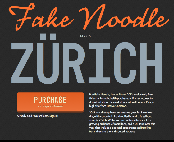
In today’s demo, I’ve used Mono45 Headline to anchor an entire layout. The edges of this big type, rather than borders or boxes, define the bounds of my composition. The right typeface can provide strong visual structure.
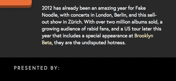
This paragraph is set in Europa, and so is the all-caps “presented by” text. Europa is perfect for bursts of short text; it has the stark simplicity of a geometric face and sets smoothly in sentences. Remember to letterspace strings of capital letters.
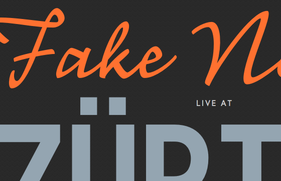
Mono45 also acts as a platform for more playful type. Here, I’ve paired it with Anatoletype’s Nouvelle Vague. Nouvelle’s dynamic strokes practically leap from the solid stage set by Mono45.
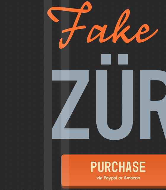
Optical alignment is critical for compositions structured by type, and is often the difference between an amateurish composition and a professional-looking one. Above, the swash of the F in Fake aligns optically with the outer edge of the Z in Zürich. And the F’s lower stroke aligns optically with the purchase button underneath. (Remember that button?)
To achieve optical alignment, I centered the headlines and adjusted their sizes until it looked right (I’m using FitText, so it was just a matter of tweaking those numbers in the parentheses above.) Then, I centered the div that contains the purchase button and adjusted its width and padding.
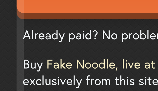
Here, another example of optical alignment. On smaller screens, paragraphs are inset to match the purchase button’s rounded corners. Another small adjustment at play here is the use of Molten Leading, a kind of fluid line-height, for flexible space between lines of paragraph text.
EuropaType fonts are available to all Typekit users. Use them to build your next composition, and again, please join us in welcoming EuropaType to Typekit.
3 Responses
Comments are closed.
Very nice. It’s interesting how the “live at” aligns with the dots in the umlaut. I love a nice geometric font that feels interested and not disinterested.
Hi, I would like to know if there is a way to enhance the loading time when I use this javascript: in my case, the loading procees keeps waiting until the whole elements are loaded.
I´d like to remove all javascript, intead of it I hope use Css3.
Thanks!
Hi there,
Typekit uses JavaScript for many reasons. You may be interested in asynchronous loading.
Tim