Sites we love
We started the sites we like column almost exactly a year ago, so it seems about time to round up some of our favorites. Here are the sites we love.
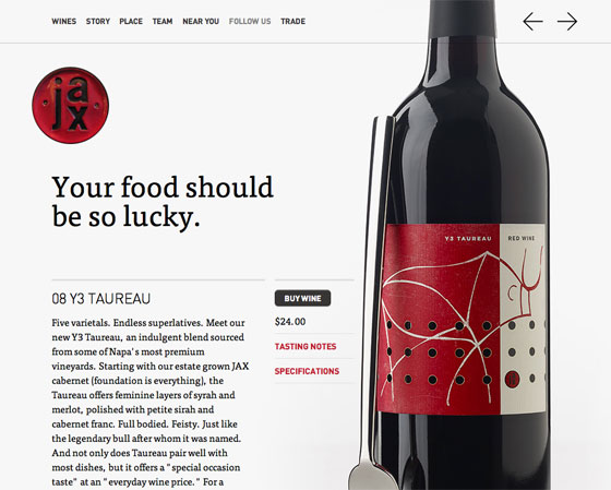
Jax Vineyards: FF Tisa, FF DIN
An early favorite, Jax Vineyards drives us to drink — in celebration, not despair. The minimal site showcases one of our favorite approaches to type: letting great copy shine.
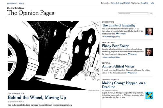
New York Times Opinion Pages: NYT Cheltenham
The New York Times Opinion Pages relaunched just over a year ago and remain a stunning example of what a good news site can do. With their custom cut of Cheltenham, the Times looks as great online as they do in print.
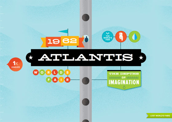
Lost World’s Fairs: Hellenic Wide, Proxima Nova, Proxima Nova Extra Condensed
Commissioned to show off just what web fonts can do, Lost World’s Fairs continues to set the bar high, both technically and aesthetically.
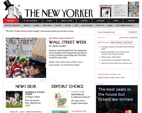
The New Yorker: NY Irvin, NY Vogue Goat
Perhaps no other publication has a font as recognizable as The New Yorker. We can’t imagine seeing their headlines in anything else.

Twitter Year in Review: Proxima Nova Extra Condensed, League Gothic
Twitter created their own best-of list at the end of last year, and it’s worth returning to. The weathered image masks show just one of the ways in which web fonts have matured alongside CSS3.

Voltage: Hellenic Wide, Proxima Nova, Bello, Bryant, Vinyl, and more
Voltage made us all drop what we were doing when it launched, and it still turns our heads. Dozens of fonts (both artfully and playfully typeset) plus forward-looking CSS combine in a layout that wouldn’t have been possible just a few short years ago.

Big Cartel’s 100 Thousandth Store: Ambroise, LTC Bodoni
From our very first sites we like, the magazine-inspired layout for Big Cartel’s one hundred thousandth store remains a personal favorite.

McSweeney’s Internet Tendency: Adobe Garamond
McSweeney’s does type-centered design like no one else, and their all-Adobe-Garamond all-the-time approach to Internet Tendency is as good as it gets.
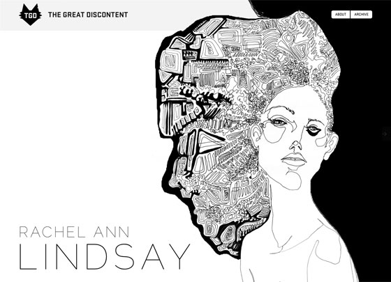
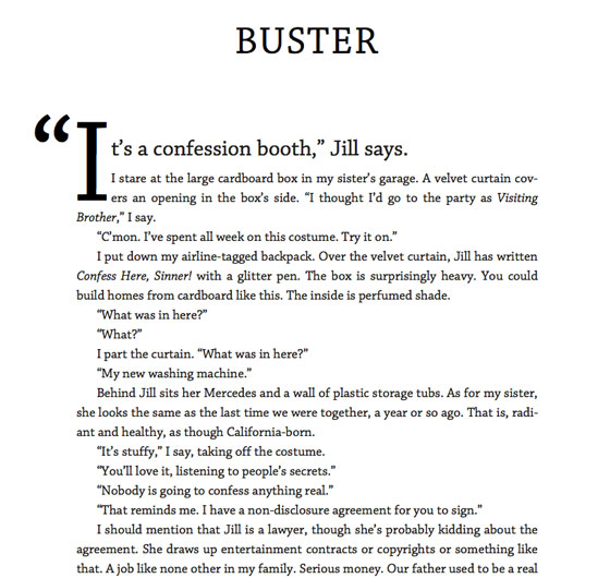
The Great Discontent: FF Meta Serif, Stratum, and more
A new arrival and love at first site, The Great Discontent features interviews with designers about their craft. Each article is uniquely art directed, pairing type and illustration to great effect.
Stories and Novels: Chaparral
Stories and Novels shows that classic book typography is alive and well — and can flourish on the screen, too.

FitText: Anchor, Proxima Nova
The fine folks at Paravel build so many wonderful things, it’s hard to choose just one. But FitText’s great big drop-shadowed headline is a show-stopper, and the plugin is pretty nice, too.
There are so many wonderful sites out there, this list could go on and on. We are daily inspired by these and other sites as we work each day to make Typekit even better. Thank you for being great.
One Response
Comments are closed.
I love New York Times’s opinion page. The styling and the text are so well matches and beautiful. They are just perfect!