Sites we like: Pentagram, New Adventures in Web Design, and Mom, this is how Twitter works
This week’s sites we like opens the new year with a redesign, a new adventure, and a lesson in social media.

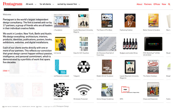
Pentagram is the world’s largest independent design consultancy. Their new design retains their minimalistic ethos and timeless color palette, with FF Dagny used for navigation, headings, and body text. The combination of grotesk (FF Dagny) and didone (Pentagram’s logo) is both classic and becoming.

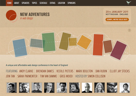
The New Adventures in Web Design conference takes place on January 20th in Nottingham. Three variations of Proxima Nova—regular, condensed, and extra condensed—lend a pleasing hierarchy and an overall sense of cohesion. Be sure to hover over the diagram on the home page for some CSS transform action.

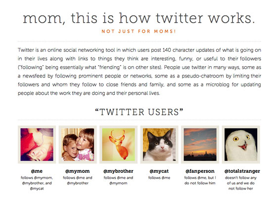
Not just for moms, but just in time, Jessica Hische brings us a succinct guide for Twitter noobs. Museo Slab and Museo Sans work in concert to clarify the subtle etiquette of tweets. Note how the long line length allows the full-justified text to display evenly, while the large text size ensures those long lines are readable.
10 Responses
Comments are closed.
If we all had Macs or Apple products, Museo Slab would be a divine font, but unfortunately such world doesn’t exist, and Museo looks pretty messed up on Windows, no matter the browser.
Otherwise I love it!
Improvements to the Windows rendering of both Museo Slab and Museo are on the way, Dragos. We’re constantly working with our foundry partners to improve the fonts in Typekit’s library — and when we do have updates, all it takes to get them is a kit republish.
Can’t wait for it Tim!
Until then I think FF Meta Serif is the next best font to use, not so classy as Museo but it looks a bit better on Windows.
Is there something you can do by working on the fonts or Microsoft should rewrite from scratch that dirty little DirectWrite render?
DirectWrite is the rewrite you are asking for, see this blog post. Yet browsers need to start using it. Currently they only do in beta versions.
Absolutely agree with Dragos here. The other nice thing about the FF Meta Web family is that it comes with small caps. Giving you more flexibility along with great rendering on Windows.
As an aside, and although I know designers dislike criticism, using full justification without hyphenation is still problematic on the web. Despite Jessica’s efforts, that paragraph on her site looks gappy.
Please consider hyphenator.js.
I know that my MetaSerif doesn’t look as “classy” as Museo, whatever that means. But since we designed it to be a workhorse, that could be a compliment. Classiness for the text on Jessica’s site means that the type is actually too thin. On my MacBook Pro screen I get more grey pixels than black ones.
By classy I meant with a little more style. In other words Museo is both strong and powerful but also chic and stylish.
MetaSerif is just strong and powerful, but as you said, it does this job very well, especially on web, where it looks quite well on Windows.
So, no offense about this Erik, is just a personal opinion, I’m not even a typography specialist, just a designer passionate about type design.
PS In the meantime I found out another great serif font that looks even better than MetaSerif on web use:D, it’s FF Tisa Web Pro, I think is somewhere between Museo and MetaSerif as design but better than both on web rendering.
@ k.l.
Thx for the article, I thought is not yet avaliable but I just installed IE9 on my testing PC and FF Tisa Web Pro and Dagny Web Pro are looking fantastic.
The questions are: what took them so long? and how long will take the people to upgrade to IE9 and Firefox 4 since some of them are still using IE6?
Anyway, the future of web typography is bright 😀
It is! (Looking at browser statistics, people seem to be pretty up-to-date when it comes to FireFox, Chrome, Opera and are using the current or at least last version. So I am optimistic.)
Is there a site that shows parents how to text as well?teehee. I’ve been reading some rather hilarious excerpts from tumblr that re-posts texts from parents, and they are entertaining. Getting back to the twitter tutorial site, I’m kind of glad my dad doesn’t do anything Internet-related, it would be all sorts of awkward if he replies to my random rants and raves on Twitter.